LensCulture: Critics' Choice 2020
LensCulture Submission Review
Hi Free, and thanks for taking the time in submitting your work with us!
I am happy to have the opportunity to review your submission and offer some thoughts and suggestions as to how you can take the work to the next level. It is important for a photographer to realize what works in the approach and what doesn't, and this is regardless if one works in a series on in singles. One of the most important abilities a photographer can possess is to transcend the mundane into a distinct moment that offers something that departs the subject matter.
I placed the images that I am drawn towards the top and after doing that the ones that I find to offer more and get me more connected with the situation are the top three without dismissing the other two photos. What gives the lead for these images is the fact that both the framing and the emotional response you are applying to portraits are more engaging, letting me enter the frame and explore more. You are giving me a glimpse of the environment in the first two photos and this creates more interaction.
1
2
The photo of the lady (4) is a fine portrait that gives me a sense of her personality but I find that when you are pulling back showing more the results are stronger. There is something more fluid and organic in the first two images and I would like you to continue in this aesthetic motif and develop it even more. You can do that by bringing more elements from the location you are photographing because this will provide another layer of information and let the viewer stay more in the frame. Image 3 is a good portrait but there is something that goes deeper in the top two and this is because of your decision to frame in the way you did, as well as the perspective, mood, and atmosphere.
3
4
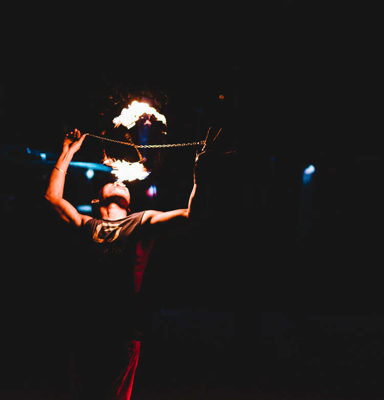
The las image is interesting but there is a lot of "dead space" around the subject. If you have moved closer to the action or used a longer focal length lens the outcome would have been more powerful. Overall, you are moving in the right direction with your work and when making future portraits I would like to suggest opening things up a little to show more ingredients that will enhance the narrative. When the people smile is always good but I am leaning more toward a more serious tone because it brings out a lot more layers for the viewer to explore.
5
Just like in business, location, location, location is what you want to aim for; the appearance of the people and how they look (facial characteristics not clothes and pose) won't change, but the environment will and this can make a world of difference. Again, the first three photos have a lot of character and something else that I would like to suggest is to consider a theme. You have the start here by making portrait of Latinos and that could easily become a long-term project.
It was my pleasure reviewing your work and I look forward to seeing more in the future.


